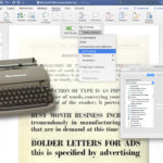
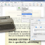
SteveCastellano.com

the foundation remains

Archive for the ‘advertising’ Category

what is a relationship without trust?

Saturday, July 24th, 2010
a stock photo of a tuna roll

what the hell does this have to do with trust?

I’ve been wilfully ignoring the Old Spice hype. That kind of makes me a bad creative guy in advertising/marketing terms, because I’m supposed to be hyper-aware of new media strategies, and (I think) because I’m supposed to cheer on successful creative, even if it wasn’t created by anyone I know, out of solidarity, or perhaps good sportsmanship. Maybe I’m a bad sport. I might even be a little jealous. But just to be clear, I don’t dislike the ads. I watched one on YouTube. It was witty and engaging. But I didn’t go seeking out any further ads from the campaign, particularly once I learned they were being churned out at an alarming rate. I didn’t think I could ever catch up, in all honesty. And I’ve got stuff to do. Hell, I didn’t even watch the whole Chad Vader series, and I really liked the first three of those.

But, you know, the buzz goes on, and eventually I was forwarded a link to a “making of” article about the online phenomenon. I was glad I read it, because I learned enough about the campaign to further forestall sitting through it all. But there was a great and almost heartwarming insight in that article. When the answer to “how can you make so much stuff so good and so fast?” gets boiled down, it sounds like this, from Iain Tait, Global Interactive Creative Director at Wieden + Kennedy, the campaign’s creators: “There is such great trust.”

And if you abstract what a creative department tries to do for its clients, you end up with that T-word again. Sure, there are different ways of saying it: engage, start a conversation, build a relationship, woof woof arf. But really, every brief could have in it somewhere, “Can you get them to trust us?” Because a relationship with your partner, or with your customer, or with your client, isn’t much of a relationship without Trust.

A while back Alex Bogusky came to town for a talk. And I don’t attend that many talks, because they tend to be quite expensive, and usually focus on broadcast, or have to be broadband enough to appeal to a wide audience and therefore cover a lot of ground that I’ve already researched on my own, or end up being, you know, a bunch of agency reels. But Mr Bogusky is about as close as our industry gets to having its own real-life rock star. I mean, there are probably people who don’t work in the industry who know who he is. And while I knew if whatever it was that made his work great could be imparted in a half-hour Q & A there would be a whole lot more great work out there than there is, I still thought it would be worth my while to go and have a listen.

Plus, I wanted to ask him a question: How do you get the freedom to do the radical things with a brand that Crispin Porter + Bogusky got to do with Burger King? And I did. I said, what, were they just desperate?

Alex replied that no, if you smell that kind of please we’ll let you try anything just help our brand desperation you should back away, because desperation is poisonous. He said what made the BK/CPB partnership work was, to a large degree, having a great open-minded, forward-thinking client who trusted them, and who had faith in their abilities.

Faith is another loaded word of course. Faith sometimes feels like the opposite of empirical evidence, particularly if you follow the monkey trial that’s been going on in the U.S. for 85 years. Faith is usually portrayed as the victim, and empirical evidence the aggressor. Folks come armed with science to destroy faith. Or so some would have you believe.

The fears of the faithful are well-founded. Toe-to-toe, facts will beat faith where the object of faith is unprovable. Not because you can’t be a scientist and a theist. You can; many are. But if you’re starting from a blank slate, and you have the choice between faith and fact, which would you choose? Facts are a sure thing, aren’t they? That’s what makes them facts. If you start with facts, you don’t need faith. (For a wry fictionalization of this principle, may I direct you to Douglas Adams’ Babel fish as proof of the non-existence of God argument).

It may seem odd to compare advertising creative to religion, but the former remains to this day the hocus-pocus of the profession. Every day it gets easier to test, track, measure and compare results. The ability of marketers to measure, and to improve results based on post-analysis, is now their primary selling proposition, and clients are buying. But where does that leave the magic of creative?

Can you test creative? Sure you can. But you have to know exactly what it is you’re testing. You have to isolate your variables or your results are worthless. For this reason, a surprising quantity of testing I’ve seen conducted in the marketing world has a hole in it big enough to drive a bus full of grade 11 science students through. And if your variables aren’t offers, or product features, but concepts, how do you know how many and what variables are involved?

Furthermore, testing creative is only of value if you’re going to be using that creative again in some form, for the same product. So as marketing budgets are more beholden to provable, predictable results, a byproduct of this increased demand for measurability is more restrictive creative guidelines, and more creative presentations that involve discussions of how it has been demonstrated that our target audience responds this way or that way to one stimulus or another. What you get in the end, more often than not, is advertising that is not only undifferentiated within its own brand, but within an entire category.

And as more marketing dollars are taken from non-measurable channels to be piled on the digital and direct response side of the scale, the real stand-out campaigns, regardless of media, will continue to be those that come from trust-based, risk-taking relationships. There’s no way anyone could prove beforehand that a half naked man beating a piñata with a fish in his bathroom would sell aftershave. But it sure as hell got my attention, and if you don’t know already, I’m a pretty tough sell.

In a 2008 career retrospective in Marketing Magazine, Ian Mirlin was quoted as saying:

I think the creatives in my era cared very deeply about what we did. I think we were given more leeway than today. I think we dealt with less research, less fiddling, less risk aversion. I think we dealt with more clients who would stick their necks out.

And this is, for me, the final piece of the puzzle. I’m not suggesting that testing and research should be done away with, or that they should carry no weight in a creative brief. But I think what Mr Mirlin is getting at here is that there is a connection between that trust – that risk-taking, that sticking-out-of-necks – and caring. An expression of trust fosters confidence, and ownership, and can only serve to spur on a creative team to excel. Sure, you’d fire anyone in your creative department who didn’t care about his or her work. But if you knew a way to make the people who care already care more, wouldn’t you want to capitalize on it at every opportunity?

There’s a sushi restaurant in New York where the menu is two words on a chalkboard: “Trust me.” This is essentially a reflection of the Japanese omakase, which can be translated as “it’s up to you” when spoken by the customer, but has its roots in the Japanese word for “entrust.” Your chef chooses what you will eat, and what you will pay for it. As a customer, you get his best quality ingredients prepared in a manner that is an expression of his individuality, his skill, his familiarity with the catch of the day, and his gratitude. His gratitude for your trust.

I think I just decided what I want for dinner.

singing the praises of moog

Saturday, May 15th, 2010
etherwave theremin front panel detail

there, that's a better picture

I didn’t mention in my previous post that my Etherwave was missing a part when I bought it. It wasn’t an essential, large, or expensive part – it was a compression nut that should have held the pitch antenna in place. Gravity does a fair job though, and as long as I wasn’t planning on playing on a moving flatbed things were going to be just fine. But I called my local dealer to ask if they had a replacement part anyway. They didn’t. They said, “We could order it for you, but you could just get one at your local hardware store.” So I went to my local hardware store, and my visit produced much head-scratching, but no compression nut. So I emailed Moog Music to ask if I could just order the part directly from them.

I emailed them on a Sunday. They emailed me back a few minutes after ten a.m. on the following day, and after confirming which part I was missing, assured me that they had it literally in hand and were dropping it in the mail for me. An envelope appeared in my mailbox this week, containing the missing part, and a spare. No charge. Not even postage.

I have had pretty much boundless admiration for the late Bob Moog and the instruments that bear his name for as long as I can remember. And to find out that the company that continues to carry his name is this decent and helpful to someone who bought one of their least expensive products second hand has really just made my week.

Marketers tend to go on ad nauseam about how important word of mouth is and what kind of social marketing strategy or viral video or what-have-you will get customers talking about their clients’ products. But Moog Music’s practice of making quality gear that they stand behind, and being just plain nice folks, is a great example to follow.

make the benefit bigger

Sunday, February 28th, 2010

bizarro comic feb 18 2010

I really have to work on my rhetorical style. And by that I mean to say that I don’t think it’s the rhetoric that’s the problem so much as the delivery. I make what I think is – what I know to be a perfect conversation-ender and then turn as if to walk away, and at that instant, someone says “Yeah, it’s like when…” Some of them know what they’ve done as soon as they do it. “I have nothing to add,” a colleague once stammered. “And now you’ve added it,” I told him.

And so it was when I sent out the above cartoon to some marketing colleagues. What I expected were replies along the lines of “LOL” or perhaps knowing nods in the company kitchen, accompanying co-workers saying, “Got that thing, it was effing righteous.” But that’s not what I got. I got, “You should write a blog post about that.”

Now I’m in the awkward position of trying to elucidate what we could have all pretended was some wry, sage, unspoken statement about our jobs, and the state of marketing in general, and left it at that. But we didn’t pretend, or leave it at that, and so this blog post is going to be like The Gospel According to Peanuts, only about a million times more soulless.

Just as a quick recap, I work in marketing. I work for an advertising company. So I can truthfully say, when asked my occupation, that I am a writer who works for an advertising company. But the question that always follows that is, “Have I seen any of your work?” And my truthful answer is always, “No, not that kind of advertising. Not the cool advertising. I write mostly digital and direct. What you unwashed masses would refer to as banner ads and junk mail.” It would be equally truthful for me to continue to explain that there is more, oh, so much more to it than that, but just because it’s the truth doesn’t mean it’s worth my time to explain, or yours to listen. Suffice it to say, this ain’t Mad Men.

Likewise, the idea that the client insists that we make the logo bigger is a trope, but with the kind of blue-chip clients we deal with it’s not even so true anymore. They don’t have to tell us how big to make the logo; they have a cirlux-bound book of brand standards that we swore on as if it were a floppy bible, on pain of a thousand mind-numbing emails from a cadre of humourless corporate lawyers, that tells us on their behalf. And if you didn’t spot the redundancy in the last sentence, it was the word humourless.

What we do get asked to do, however, is make the call to action bigger (like so many things in our business, the part of the ad that tells you what to do has a super-secret marketing name and an acronym to go with it). The call to action, or CTA, is the “act now” bit at the end; the URL; the 800 number; the part that tells you what to do if you like the thing that the ad is telling you about. The CTA has to pop. It has to be in a coloured box. It should, perhaps, be a “hot” colour like red or yellow. A former president at one agency I have worked at called, quite straight-facedly, for a design standard in which the CTA was “as big as the headline.”

Well I used to be an art director, and I still have some vestigial knowledge of what kinds of problems these suggestions can cause from a perspective of visual aesthetics. And what you can’t really tell people about aesthetics in marketing and advertising if they don’t already believe it is that the way your stuff looks, in particular how good it looks, how much respect it shows for the visual cortex of your audience, speaks to the character of your brand as clearly as your headlines – which is why a former creative director of mine suggested, in typically diplomatic and understated terms, that we attempt to “err on the side of good taste.”

And what I know as a writer (a senior writer, if you please), is that no one is going to act now, or act at any time, if that action isn’t going to make them better off, in their own estimation, than they would be if they did nothing. Which means we have to give some weight and thought to what the hell is so cool about what we’re trying to sell them. This seems obvious to me, and to many people I talk to – but surprisingly it’s not obvious to absolutely everyone. I don’t fault my clients for loving their products. Their products are as much their children as my first draft copy decks are mine. But unless you’re Apple (and maybe we’ll have a chat about blind Apple adoration sometime in the future) you are on thin ice if you just assume that a big old hero shot of your product and a bone-dry list of techs and specs is enough to compel them to jam a crowbar into their wallets and buy one from you.

Look at it this way. All offers are essentially discounts. Order by x date and save y. Or maybe we’ll send you some kind of tchotchke or throw in some service that we’re going to try to convince you that you wanted anyway, so by giving it to you for free we’re saving you money; same difference. But a discount on something your potential customer is not sure he or she wants – about which the benefit has not been communicated to their satisfaction – is hardly a bargain. You might as well be giving away free pieces of paper. But if you can manage to convince them that your product is worth owning, and will benefit them in some way, they might end up actually wanting to read the CTA. And if  the reader is actively seeking it out, maybe it doesn’t have to be the same size as the headline, or in a neon colour, or in a starburst. Maybe you can shrink it down to a more reasonable size.

Like, say, the logo.

i would be willing to pay more for one that wasn’t thrown

Monday, January 11th, 2010
craigslist ad for drum, thrown

I don't consider that normal wear and tear

brand differentiation fail

Monday, January 4th, 2010
two very similar billboards

Sorry about those trees, we'll have them cut down immediately.

I have often said, of my day gig in advertising, “If this job is ever difficult, it’s because somebody screwed up.” You might think that’s pretty upbeat coming from me until you realize that only one screw-up has to be signed off on to make an entire campaign, or even a brand, difficult. And sometimes one screw-up is made up of a bunch of tiny, intricate, co-dependent screw-ups. Conversely, one screw-up that happened years ago can continue to resonate in work I have yet to complete. You get it. It’s like that old chaos theory chestnut.

I haven’t worked on either of these brands so I can only guess at what made these ads into a punchline. Many will immediately blame a failure of creative imagination; others might blame the media buyer. My theory is that the guidelines for the brand on the left were cooked up south of the border, and then applied rigorously in a market where a strong local brand presence had already been using the same layout and font for years. The rest is a foregone conclusion. It was practically fate that these two billboards would meet sooner or later.

That’s not to say we couldn’t pick at the execution if we were being churlish. Yeah, that Sensodyne billboard reads like a brief, but that’s pharma for you, for the most part, particularly in a medium where you have fewer than 10 words to get your point across. And I’m sure it’s not the first (or best) headline the creative team came up with. I also imagine this conversation happening somewhere between the creative presentation and final sign-off:

CLIENT: It has to be clear that the person making the statement is an expert. Ideally a dentist.
CREATIVE TEAM: Well, he is wearing a white coat and talking about toothpaste.
CLIENT: I don’t think it’s obvious enough. He could be an OB/GYN. Or a veterinarian.

(If you can’t make out how that particular issue was resolved, click on the image for a closer look.)

My sympathy is not reserved solely for the Sensodyne team. I don’t think making the hippo board would have been that much more fun. The look of Telus ads hasn’t changed appreciably in over 10 years: Creature, check. White background, check. Helvetica Neue, check. Sure, you get to work with a nice clean layout and cute animals. Imagine if writing lolcats was your job! But try having the same thing for lunch every day for a couple of weeks and get back to me. Oh and I almost forgot to mention, try something else for lunch and you’re fired.

I have to thank my wife, who has a keen eye for the absurd, as well as for hippos, for pointing this rather awkward juxtaposition out to me (and photographing it). She also suggested a slight improvement to the Telus billboard, and I have obliged; results are here.

that’s how you do it

Saturday, January 2nd, 2010
proteus 1 for sale on craigslist

seen on craigslist musical instruments for sale

5 words I don’t want to hear in 2010

Friday, December 25th, 2009

The end of the year is a time for lists, and as I am a writer it only seems natural that my list is about words. And because I am cranky, it is equally natural that my list is about words I don’t like.

To be clear, I am not fascistic about the English language; language is an organic thing that grows and changes over time, and I accept that. I have biases of course, but I will be the first to admit that many of them are subjective. They are, however, well-considered, and difficult to refute without being cursed and derided roundly. And because my intention is not only to deride but to educate, I offer suggestions here that will make your discourse at least as effective, if not more, once you have eliminated the offending words from your vocabulary.

Usability
The shame about this word being on my list is that there’s nothing wrong with it. But we in the business of creating websites and other things people can mess around with on the internets (I’m not going to say “online experiences” because that one narrowly escaped this list and may yet find its way into an addendum) have been using it for a long time now, and too many of the people we’re saying it to still have no idea what we’re talking about. Maybe a new word would help; I’m willing to try anything at this point. Suggested alternative: sense-makingness.

Tout
This word was ruined for me by a hipster creative director who used to come into my office and put his stinky Converse-clad feet up on my desk while we were talking. He is also remembered for unironically uttering the words, while attempting to high-five me, “Come on man, don’t leave me hanging.” Irritating dig-me personalities aside, this word just sounds ugly. And when you use it as a noun, the etymological connotation is of a shill or con man. Is that what you meant to say? I didn’t think so. Suggested alternatives: sell, advertise.

Amuse bouche
I’ve got nothing against dragging non-English words and phrases into your conversation or writing if they actually express something that doesn’t have a precise English equivalent. Ennui, for example, is distinct from mere boredom. The German language has a lot of unique and appropriate compounds like weltschmerz and schadenfreude that you can’t really duplicate in English. But not only does amuse bouche not describe anything that can’t be described equally well in English, it is composed of a couple of words that pretty much any Canadian student learned in grade 4 French class, and so my brain hears “amuse mouth” before it hears “appetizer.” And then my brain becomes angry. Suggested alternatives: appetizer, palate cleanser, taste.

Optics
This is a great example of people trying to use a word in order to sound clever and failing miserably. That’s pretty commonplace in the marketing industry, but the misuse of “optics” has infected the world of journalism, and I suspect PR flackery was the carrier. I don’t have any objection to this word when it appears in its natural habitat. But if you’re saying “the optics aren’t good” and you’re not talking about the kit lens that came with your entry-level DSLR camera, consider my objection lodged, and if you’re lucky it’s not lodged where I’d like it to be. Optics already means something guys, and it’s not what you’re using it for. Suggested alternatives: look, looks. As in “It looks good” or “It doesn’t look good.”

Olympic
I have little to no interest in sport but even if that wasn’t the case I don’t think you could convince me that there aren’t enough world championships already. In fact, if your sport of choice doesn’t have a means of determining who in the world is best at it outside of the Olympics, please consider the possibility that no one really cares. And speaking of not really caring, all the Olympic city selection scandals, bribed judges, boycotts, doping, and sponsorship saturation have pretty much obliterated any recollection of this tradition’s noble and historic origins. Suggested alternatives: None. Do us all a favour and pack it in. Special Olympics get a special dispensation, of course.

Additional suggestions are welcome in the comments.

usury loves company

Wednesday, April 29th, 2009

I have no sympathy for Money Mart and their ilk, so I quite enjoyed this recent Star article and the Google Ad Fail that followed (click for full size image). payday-ad-fail

note to self

Sunday, March 22nd, 2009

If offered, do not accept a position writing for Google.

During a subsequent presentation, [Marissa Mayer, VP  of Search Product and User Experience at Google]  is unimpressed by  possible language for a Google Health page that would allow users to share medical information.

“I don’t like the words ‘invite’ and ‘view,’” she says. “Those two words are recreational. It feels too informal and lighthearted.”

“We used the word ‘invite’ because it’s an action word, so users know they have to do something,” a young product manager responds.

Ms. Mayer rolls her eyes. “It’s not a party,” she says.

Putting a Bolder Face on Google, New York Times, February 28 2009

best wtt* ad ever

Monday, May 19th, 2008

Remember when the guy came back to the present time after stepping on the butterfly in Bradbury’s classic A Sound of Thunder and all the signage looked like this?

*that’s “want to trade,” not “women travelling together”

kijiji want-to-trade ad